The PartsWatch Grid
The PartsWatch Grid is a uniform grid with a variety of features that can be found across the application.
PartsWatch Grid Training Packet - 1 page
PartsWatch Grid Keyboard Usage - 2 pages
PartsWatch Grid Function Overview
The grid includes the following functions:
- Sort by a single column
- Sort by multiple columns
- Search box to search/filter contents using all columns in the entire grid
- Filter columns by one or more criteria based on the column's contents
- Rearrange columns
- Change the width of any or all columns
- Hide or display single or multiple columns
- Dynamically group the data based on any column within the grid
- Display a footer so that calculations can be performed on numeric columns such as 'Sum', 'Min', 'Max', 'Count', and 'Average'
- Apply color formatting to cells based on certain conditions
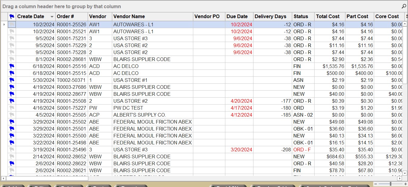
The colors in the grid indicate important information:
-
White cells in a row indicate read-only data.
-
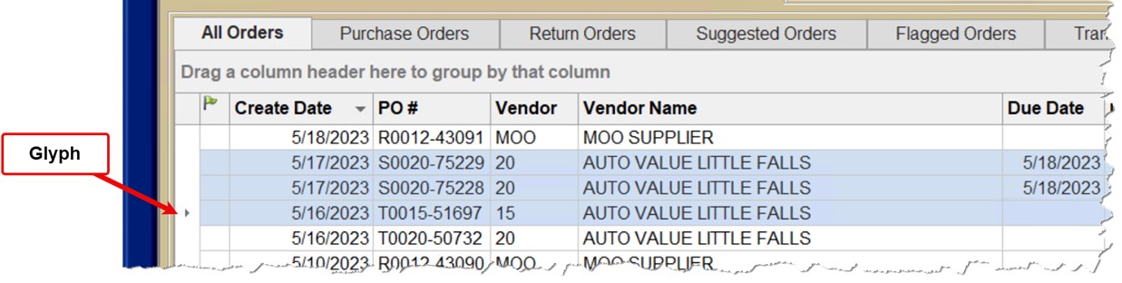
A selected row is displayed with blue shading. The cell in focus is outlined in black and remains shaded blue.
-
Note: The row in focus will be marked with a "glyph" symbol/row indicator symbol.
-
Grid changes, such as font size, column order, column filters, etc. are not retained from session to session. To save grid characteristics, create a Profile.
A column width change does not persist when the screen is closed and reopened, even when using a Profile. Each grid is drawn where all columns are best fit to the contents of the largest item in the column.
Note: The grid can be returned to factory default settings at any time by right-clicking on a column heading and selecting 'Restore Default View'.
Keyboard keys can be used to navigate the grid:
-
Use the up and down arrow keys to move the selected row up or down.
-
Use the left and right arrow keys to move the selected cell within the selected row left or right.
-
When the cell in the right-most column is reached, the right arrow key will advance to the first column of the next row.
-
When the cell in the left-most column is reached, the left arrow key will advance to the last column of the previous row.
-
-
The 'Tab' and 'Shift'+'Tab' keys behave like the left and right arrow keys.
-
Press the 'Home key to select the first cell of the selected row.
-
Press the 'End' key to select the last cell of the selected row.
-
Press 'Ctrl'+'Home' to select the first cell of the first row of the grid.
-
Press 'Ctrl+'End' to select the last cell of the last row of the grid.
-
The 'Page Up' and 'Page Down' keys may be used to move the selected row up or down by approximately twenty rows.
-
Multiple rows may be highlighted/selected by using the standard Windows control keys 'Shift' and 'Ctrl'.
Right Click Menus
There are four different right-click menus on the PartsWatch Grid:
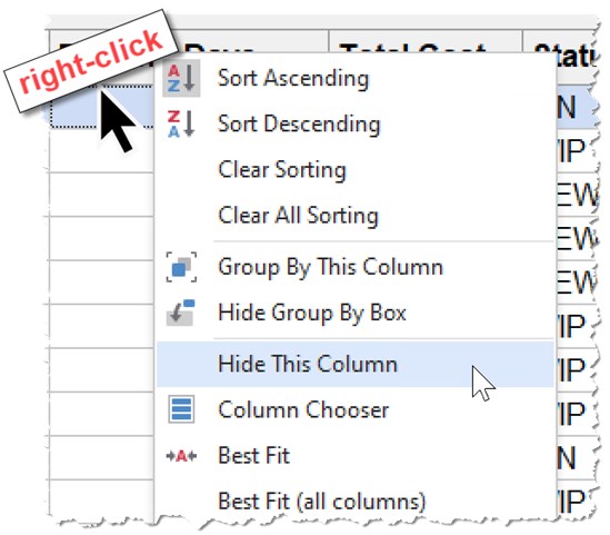
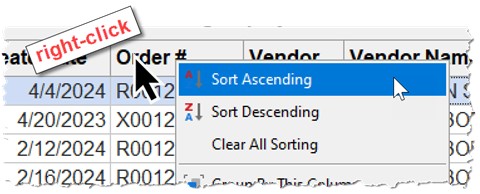
Right-Click Menu: Column Header
Right-click on a column header to display the right-click menu:
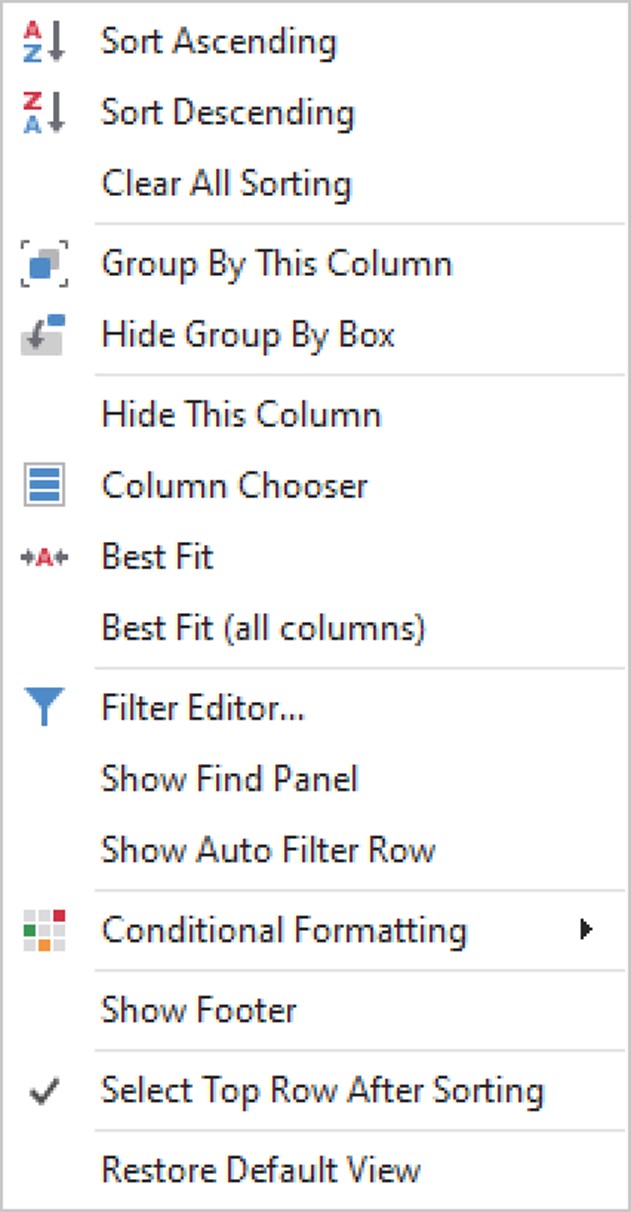
Click 'Sort Ascending' to sort the column/grid by that column in ascending order.
Click 'Sort Descending' to sort the column/grid by that column in descending order.
Click to clear all column sorting in the table and restore the sorting to the default or the set sorting for the Profile.
Click to group the grid data by the column that was right-clicked. This is the same as dragging and dropping the column heading to the 'Drag a column header here to group by that column'.
Click this option to remove the row 'Drag a column header here to group by that column'. If it is hidden, the option changes to 'Show Group By Box' and the row 'Drag a column header here to group by that column' reappears.
Click this option to remove the column that was right-clicked.
Click this to display a pop-up window allowing users to hide or display columns.
Click this option to resize the width of the selected column to be wide enough to view its contents.
Click this option to resizes all columns of the grid to be wide enough to view each column's contents.
This option only appears if the selected column has a filter applied. Click the option to clear the column's filter.
Click this to open the 'Filter Editor' pop-up.
Show Auto Filter Row / Hide Auto Filter Row
Click this option to toggle the display of the Auto Filter Row.
Click this option to display a sub-menu of these options:
- 'Highlight Cell Rules'
- 'Top/Bottom Rule'
- 'Unique/Duplicate Rules'
- 'Data Update Rules…'
- 'Data Bars'
- 'Color Scales'
- 'Icon Sets'
- 'Manage Rules...'
For more information see the Conditional Formatting section.
Click this option to display or hide a footer at the bottom of the grid.
Checkbox that determines if a row is selected automatically after sorting.
- Checked (default) - When the grid is sorted, the top row is selected and the grid is scrolled to the top.
- Unchecked - When the grid is sorted, the existing row remains selected.
Click this option to display a pop-up stating: "Are you sure you want to Restore Default View?" Click the 'Yes' button to restore the grid to factory default settings. Hidden columns will be displayed, column order will revert back to defaults and filters will be cleared. Column widths and order will also revert to defaults. Click 'No' to close the pop-up and the grid remains unchanged.
Right-Click Menu: Group Panel
Right-click on the 'Group By' box to display the right-click menu:
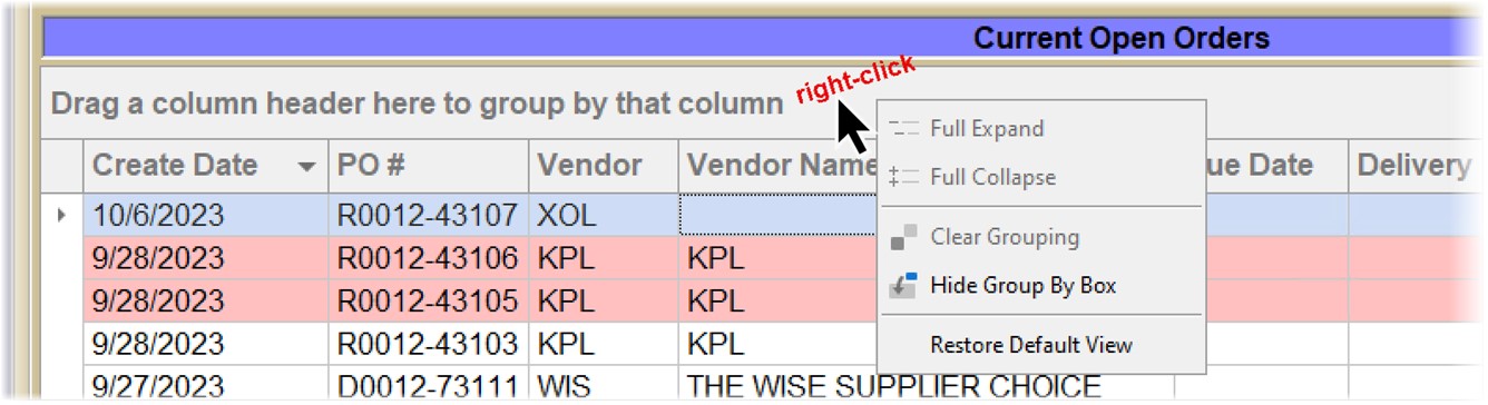
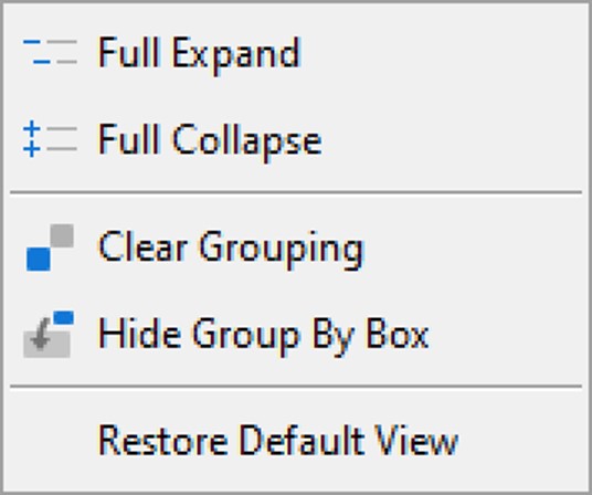
Click this, and if the grid is grouped by any field, the application expands all groupings.
Click this, and if the grid is grouped by any field, the application collapses all groupings.
Removes any grouping already applied. The grid can also be ungrouped by clicking and dragging the group label back to the column heading area.
This hides the 'Drag a column header here to group by that column' row. Once hidden, it can be displayed from the right-click column header menu by selecting 'Show Group By Box'.
Click this option to display a pop-up stating: "Are you sure you want to Restore Default View?" Click the 'Yes' button to restore the grid to factory default settings. Hidden columns will be displayed, column order will revert back to defaults and filters will be cleared. Column widths and order will also revert to defaults. Click 'No' to close the pop-up and the grid remains unchanged.
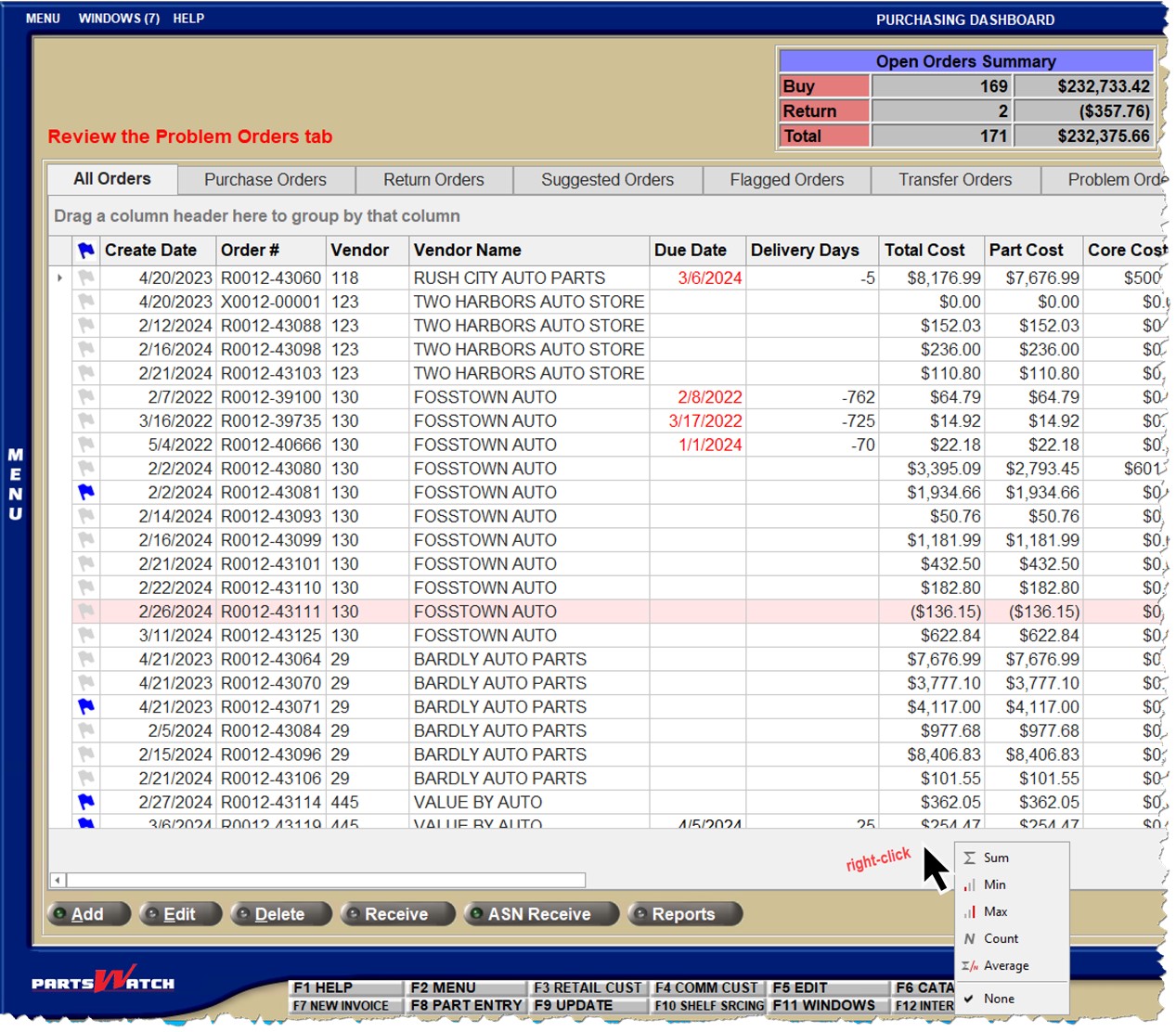
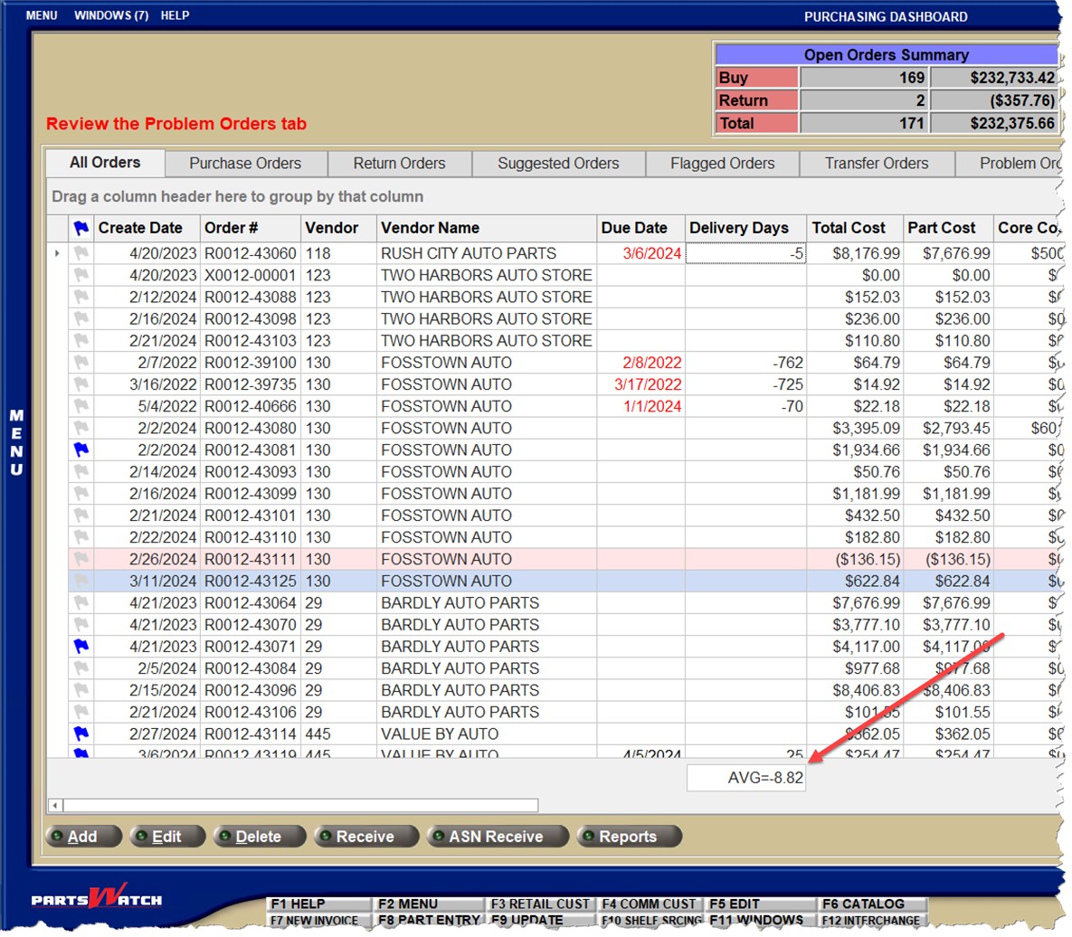
Right-Click Menu: Footer Summary
Note: To view the summary menu, the grid's footer must be displayed or there must be a grouping established.
Note: To show the footer, right-click on a column heading and select 'Show Footer'.
- Right-click the summary area under the column you are interested in to display the right-click menu.
- Then, select one of the items in the menu to aggregate the group's column by that value (e.g. 'Sum', 'Min', 'Max', etc.)
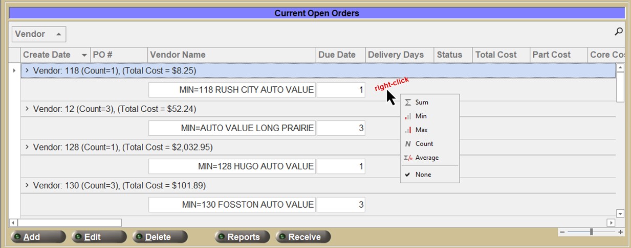

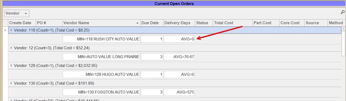
Here is an example where 'Average' was selected for 'Delivery Days'
Right-Click Menu: Row-Level
The row-level right-click menu is dynamic and based on the data in the grid. Right-click menus vary from screen to screen.
If multiple rows are selected, the right-click row menu may be different from the same right-click on a single row.
Columnar Functions
This section describes functions that apply to columns within the PartsWatch grid.
Column Width
Position the cursor between two column headings until the cursor changes to a double-arrow and click and drag the mouse left or right, to resize the width of a column.
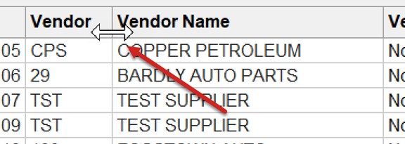
Note: Changing column widths only affects the current session. If the screen is closed and then reopened, all columns are displayed as "Best Fit", meaning the column width is wide enough to display the longest value within it.
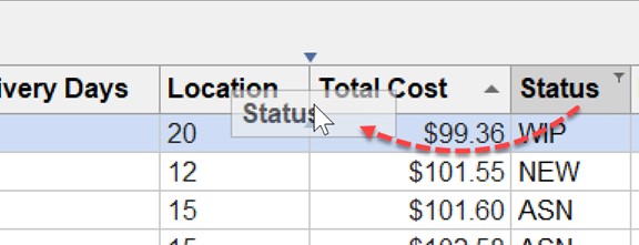
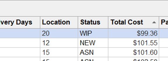
Column Order
To move a column's position, drag-and-drop the column heading left or right to the desired destination position.
Column Hide/Show
To hide a column, right-click on the column header and select 'Hide This Column'.
To display a column that was previously hidden, right-click on the column header and select 'Column Chooser'.
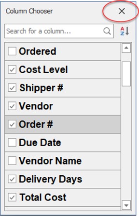
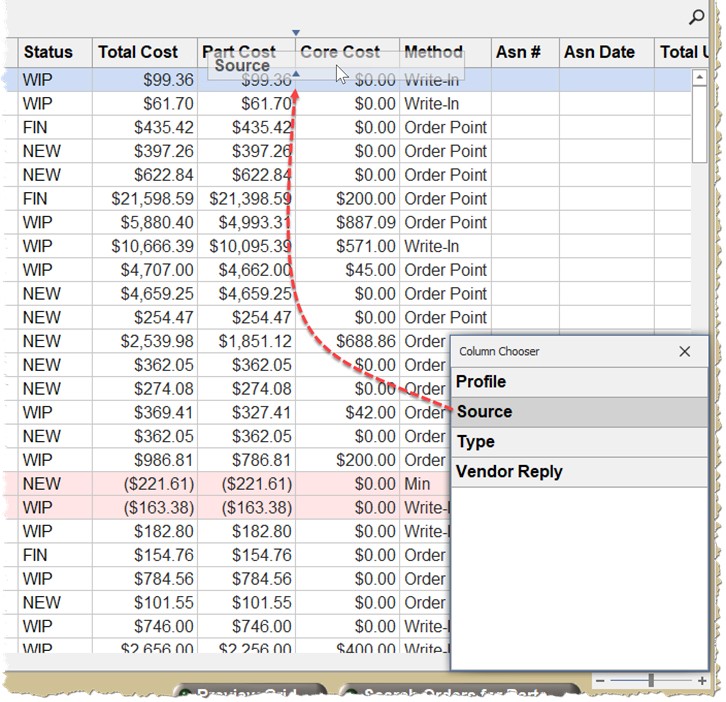
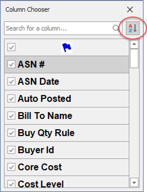
Column Chooser
The Column Chooser is used to redisplay hidden columns as well as to hide columns. Multiple columns can be displayed or hidden from the same pop-up.
Display the Column Chooser
Right-click on any column heading to display the right-click column header menu and select 'Column Chooser'.
- The 'Column Chooser' pop-up appears in the lower-right portion of the grid.
- The 'Column Chooser' pop-up remains visible until it is hidden or the screen is closed.
Hide the Column Chooser
Click the 'X' in the upper-right corner of the pop-up to close the 'Column Chooser'.
Resize the Column Chooser
To resize the 'Column Chooser' pop-up, position the mouse cursor over any edge of the pop-up.
Once a double-arrow cursor appears, click and drag to make the pop-up larger or smaller.
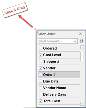
Reposition the Column Chooser
To reposition the 'Column Chooser' pop-up, drag-and-drop its title bar to the area of the screen desired. Note: It will remain in this new position even if you close and reopen it later within the same session. Once, however, the screen is closed and reopened, the 'Column Chooser' will display in the lower-right area of the screen when launched.
Hide Columns
To hide columns displayed in the grid using the 'Column Chooser':
- Click the checkbox to the left of the column name in the 'Column Chooser' to uncheck the box and hide the column (remove it from the grid).
- Drag-and-drop the column header from the grid onto the 'Column Chooser' list.
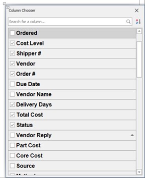
Display Hidden Columns
To display hidden columns using the 'Column Chooser':
- Click the checkbox to the left of the column name in the 'Column Chooser' to check the box. The column will appear in the grid in its original position.
- Drag-and-drop the column header from the 'Column Chooser' list back to the column heading area of the grid. Note: Where the column is dropped will be its new position in the grid.
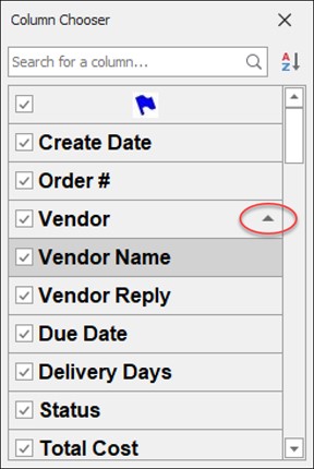
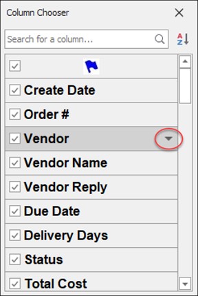
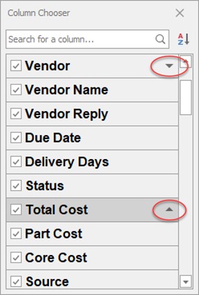
Sort the Grid by a Column
-
From the 'Column Chooser', click the mouse to the right of the column name label text.
-
The grid will be sorted in ascending order (represented by an "up" triangle) for that column.
-
Click to the right of the column name again to change the sort to descending order by that column.
-
Hold the 'Shift' key down and click another column to add a secondary sort to the grid. This can be repeated for as many columns as desired.
Grid sorted in ascending order by Vendor:
Grid sorted in descending order by Vendor:
Grid sorted in descending order by Vendor and then in ascending order by Total Cost:
Note: The grid may be sorted by a column that is hidden.
Sort the List of Columns
-
In the 'Column Chooser', click the sort icon to sort the list of columns in the list alphabetically A to Z.
-
Click the sort icon again to sort the list Z to A.
-
Click the sort icon a third time to return the list to its original order.
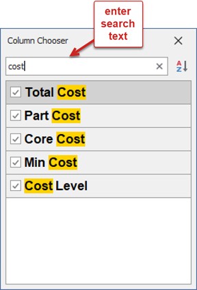
Search for a Column
Rather than scroll through the list of columns, type in a keyword to quickly locate a desired column.
All columns that contain the keyword are displayed.
Column Sorting
To sort a grid on a column, click the column heading once to sort in ascending order. The sort icon is displayed as a triangle pointed up.
Click the column heading again to sort it in descending order. The sort icon is displayed as a triangle pointed down.
To sort by additional columns, after the first column has been sorted, right-click the heading of the second column to sort by and select either 'Sort Ascending' or 'Sort Descending'. This can be repeated for any number of columns.
Column Filtering
A grid may be filtered by values contained within a column, a range of numerical values or text strings. A grid may have multiple columns with applied filters.
When the mouse cursor hovers over a column heading, a 'Filter' icon appears:
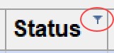
Click the 'Filter' icon to display the column's filter menu.
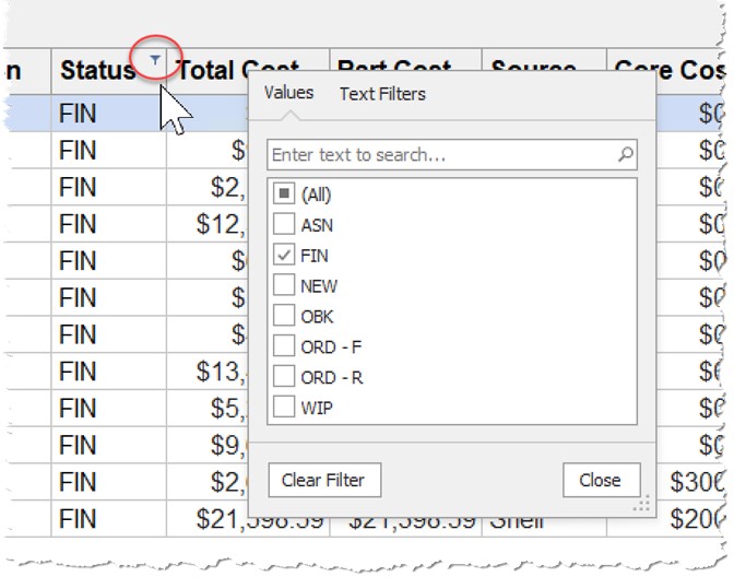
Here is an example where text values may be selected for the filter. One or more items may be checked or 'All' may be selected. As items are checked or unchecked, the underlying grid will automatically update. Only values that exist in the column will be listed.
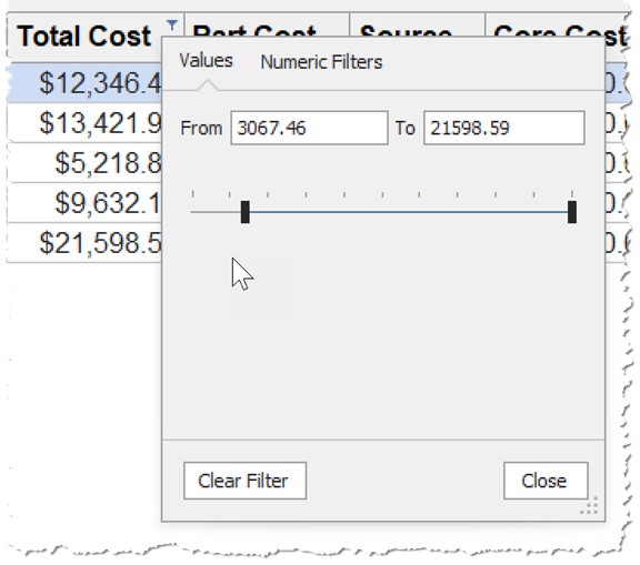
Here is an example of a Filter menu where the column contains numerical values. A range of values may be used to filter the grid.
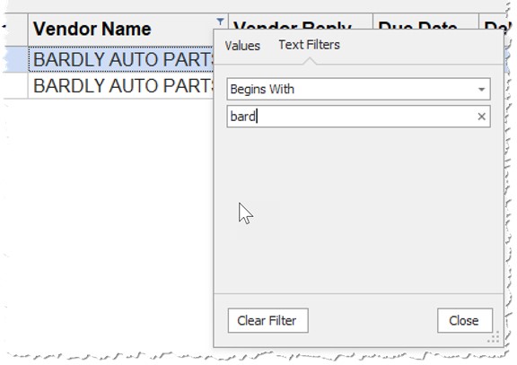
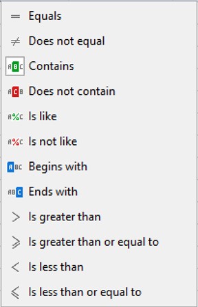
Here is an example where a column with text can use a keyword to filter by. The drop-down 'Begins With' contains other options including 'Equals', 'Contains', and many more options to choose from.
To clear a filter in a single column, use the 'Clear Filter' button as shown in the filter menu.
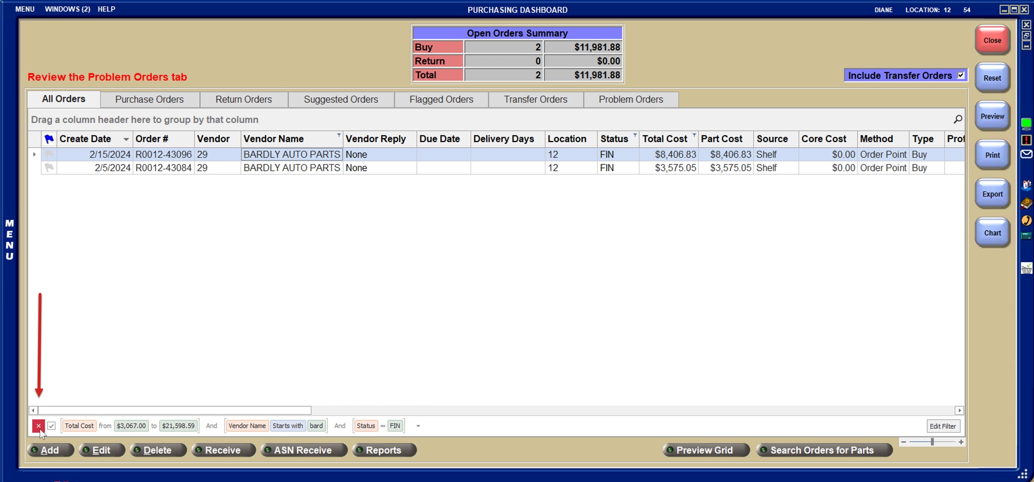
To clear all filters, click the red 'X' in the beginning of the filter expression as shown here:
Auto Filter Row
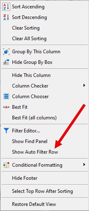
From the column right-click menu, click 'Show Auto Filter Row' to display the Auto Filter Row.
The Auto Filter Row appears underneath each column heading. It remains visible until 'Hide Auto Filter Row' is selected from the column right-click menu. It allows the grid to be filtered by multiple columns at once.
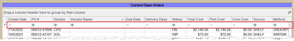
Left-click on the symbol in the cell of the Auto Filter Row.
- The '=' symbol displays the following menu:
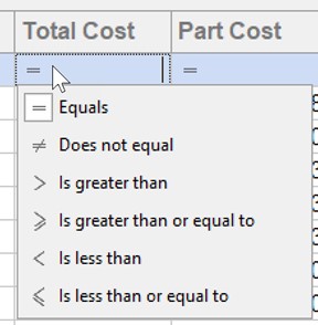
- The text symbol
 displays the following menu:
- When a filter is added, the condition is displayed in the grid footer:

Conditional Formatting
Conditional formatting is applied on a column. Depending on the contents of the column's cells (e.g. text vs. numbers) different types of formatting may be applied. For example:
- For a column with text, a string can be searched that is equal to another string, contains another string, starts or ends with another string as a few examples.
- For a column with numbers, values can be searched that are greater than, less than, between, equal to another value. The Top or Bottom 10 items, Top or bottom 10% or even averages can also be identified. The format of the cells of one column can be based upon the values of cells in another column.
- Once the values or strings are identified the text can be made bold or italic or red, green or yellow. Strikeout is also an option for text.
- The system can analyze all column cell values and apply visual indicators to identify relative values in each cell as compared to other cells in the column.
- The following is available to be highlighted:
-
specific values and dates
-
cells with the smallest or largest values
-
values below or above an average
-
unique or duplicate values
-
- A custom formula may be used to apply a color to specific cells.
- Cells can be temporarily highlighted when their values change.
- Values in one column can be formatted based on comparison to another column (e.g. if the value in column B is > column C, shade the cell in Column B red).
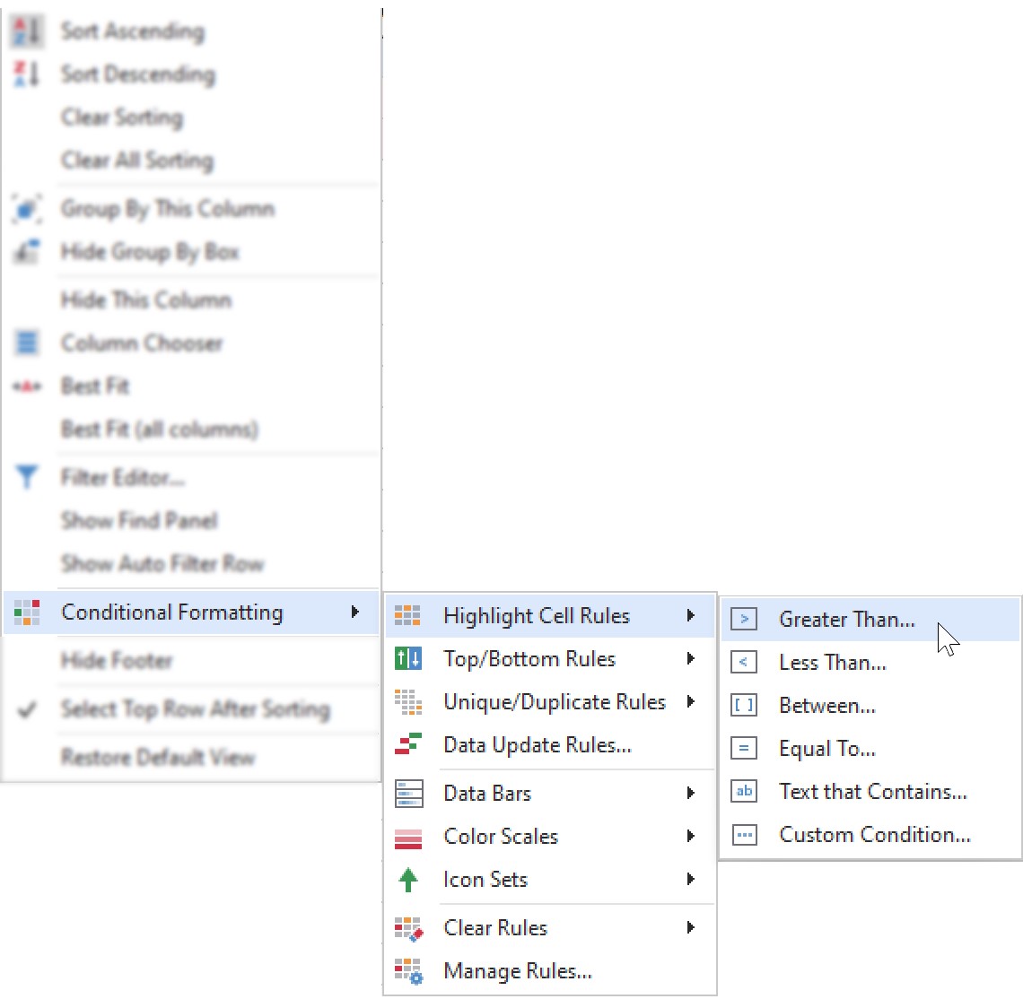
To apply conditional formatting, right-click the column header for the column that formatting should be applied to and select 'Conditional Formatting'.
Highlight Cell Rules
Click this option to format cells within the column that might be:
- 'Greater Than...' - Specify a value and then identify the formatting for cells that meet the criteria such as bolding the text, making the text italic, making the text color green, red, or yellow, and/or changing the cell shading to green, red, or yellow. Click 'OK' and all cells in the column that meet the criteria will change.
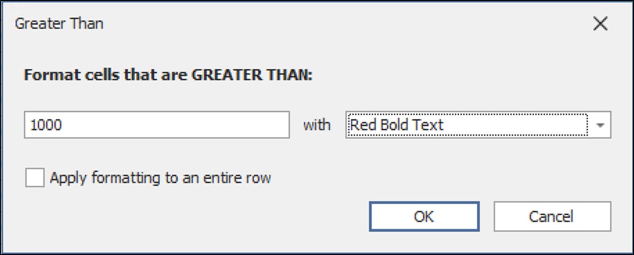
- Click the 'Apply formatting to an entire row' selection if the entire row should receive the formatting rather than the individual cell within the column.
- 'Less Than...' - Same as greater than when but the cell contents must be less than the value specified.
- 'Between...' - Same as greater than but allows the specification of two values that the cell contents must fall between in order to be formatted.
- 'Equal To...' - Same as greater than but the cell contents must equal the value specified.
- 'Text that Contains...' - Used for columns with text data. Specify a keyword or portion thereof and apply formatting to cells that contain the text value entered.
- 'Custom Condition...' - This option allows for the creation of nested conditions for the formatting. One column, for instance, can be formatted based on the conditions of another column.
Top/Bottom Rules
For cells in the same column with numerical values,you can format based on:
- The Top 10 items
- The Top 10% of items (or any numerical % between 1-99)
- The Bottom 10 items
- The Bottom 10% of items (or any numerical % between 1-99)
- Above Average - Calculates the average of all cells in the column and formats those above the average value.
- Below Average - Calculates the average of all cells in the column and formats those below the average value.
Unique/Duplicate Rules
For columns containing numerical or text values.
- Unique Values - Using this criteria will format cells in the column with unique values.
- Duplicate Values - Using this criteria will format duplicate cells within the column.
Data Update Rules
For columns containing numerical values.
- Allows cells to be formatted in a column that has changed, increased, or decreased.
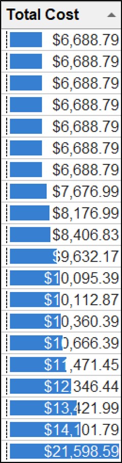
Data Bars
For columns containing numerical values.
- Solid or gradient fills can be applied within a column.
- This is relative formatting. The system examines all values in the column and applies the most shading to the cell with the highest values and decreases the shading for all other cells relative to the one with the highest value.
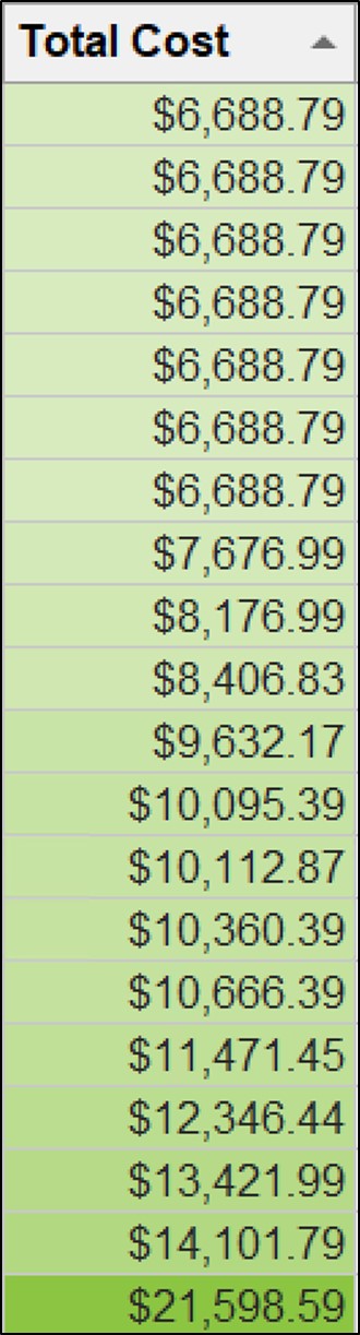
Color Scales
For columns containing numerical values.
- Similar to Data Bars, Color Scales apply a range of colors to the entire cell within a column based on its relative value to the highest cell in the column.
Icon Sets
For columns containing numerical values.
- Similar to Data Bars, Icon Sets apply a symbol within the cell to represent its relative value to other numerical cells within a column.
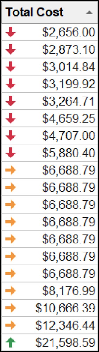
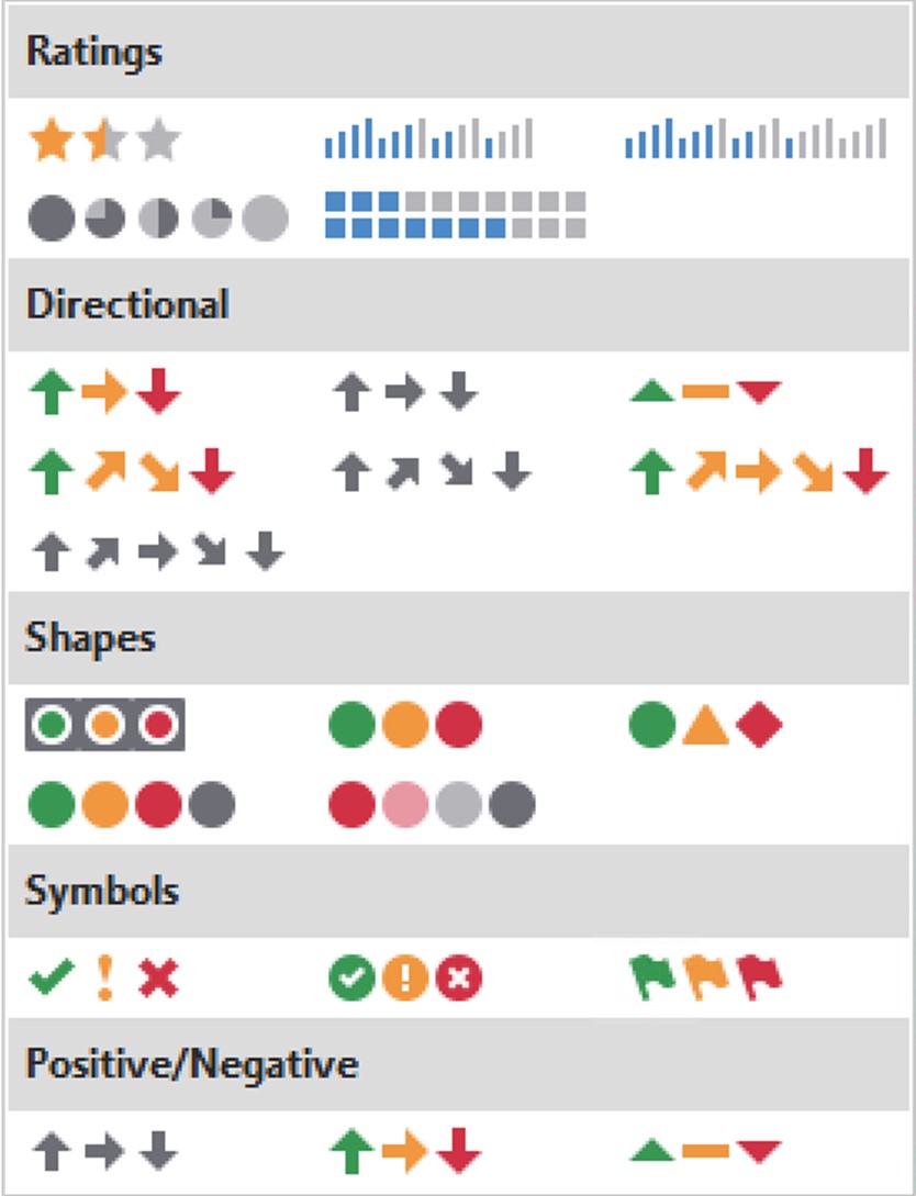
- Here are the icon options:
Once conditional formatting is applied, it is only in effect during the current session. If you wish to save your conditional formatting settings, create a Profile.
To clear conditional formatting settings:
-
Right-click the column heading with the conditional formatting.
-
Select 'Conditional Formatting...'
-
Clear Rules
- 'Clear Rules from This Column' – Clears the formatting for the selected columns.
- 'Clear Rules from All Columns' – Clears the formatting for all columns in the grid. This options will only appear if multiple columns contain conditional formatting.
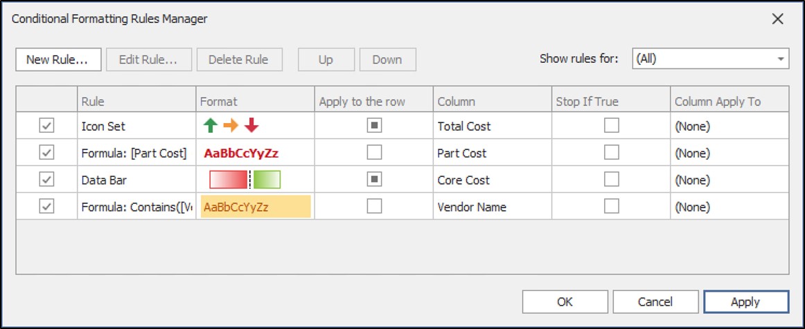
Manage Rules
This is an advanced option that displays a pop-up allowing for the viewing, editing, or deletion of all the various conditional formatting rules that have been set on the grid.
To learn more about the above settings, watch the videos in the PartsWatch Grid Training Packet!
PartsWatch Grid Training Packet - 1 page