Navigating PartsWatch
Training Packet: Graphical User Interface - 1 page
About:
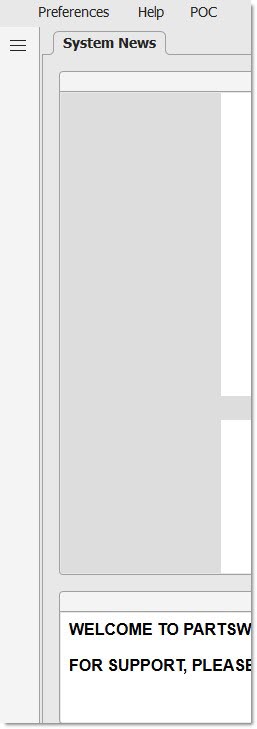
System News - Home Page
.png) Home Page - 3 minutesHome Page - 3 minutes
Home Page - 3 minutesHome Page - 3 minutes
SYSTEM NEWS is the home page and the first screen that opens in PartsWatch after entering a User ID and Password. Learn more about the System News screen by clicking here.
Border Uses
Training Packet: Graphical User Interface - 1 page
The top and bottom borders that "frame" the screen contain icons and buttons for quick access to information and features that are available on every PartsWatch screen.
Border icons may or may not be visible, or clickable, depending on who is logged in and how the User Security permissions are enabled.
Border - Top of Application

Title Bar
The "Title Bar" contains the application logo and the application name, such as "PartsWatch". It also contains the standard window controls to minimize the application, make the application full screen, or close the application.
Ribbon Bar
The "Ribbon Bar" contains the 'Menu', 'Preferences', and 'Help' selections. If the 'Menu' is set to 'Inline' or 'Overlay', the text 'Menu' does not display.
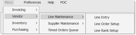
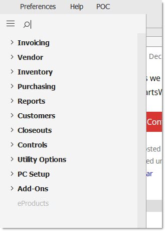
Menu
The 'Menu' selection opens a list of application screens, called 'modules' in PartsWatch.
A small right arrow '>' displays when additional sub-menus exist for a module. Hover over the arrow with the mouse to display the menus.
Because every screen in PartsWatch is controlled by security permissions, a menu may be:
Enabled:
Grayed out and unavailable:
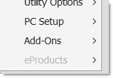
Menu items may also be hidden, and will not display.
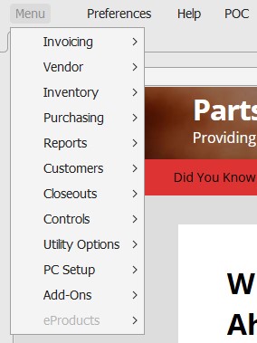
The following are the modules accessed from the main 'Menu'.

The Menus - 6 minutesThe Menus - 6 minutes
See below when the 'Classic' menu selection is chosen.
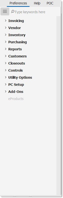
See below when the 'Inline' menu selection is chosen. Click the "hamburger" icon to open and close the menu. When the selection is 'Inline' and the hamburger menu is clicked, the menu opens, and the screen resizes to fit the menu on the left.
See below when the 'Overlay' menu selection is chosen. Click the "hamburger" icon to open and close the menu. When the selection is 'Overlay' and the hamburger menu is clicked, the menu opens on top of the screen, overlaying it.
Searching the menu:
The search box is only available for the 'Inline' or 'Overlay' selections, it does not display in the 'Classic' menu.
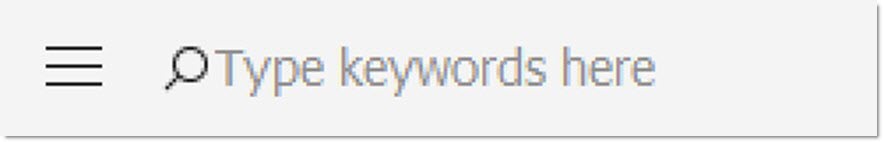
Click in the search box and start to type a word. The menu expands and displays all screens that match the text entered.
Use the 'x' character to the right of the search box to cancel the search.
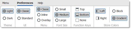
Preferences
Click the 'Preferences' button in the Ribbon bar to open the 'Preferences' ribbon. One of two ribbons will display:
The following ribbon displays when the 'Classic' menu is selected:
The following ribbon displays when the 'Inline' or 'Overlay' menu is selected:
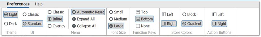
Selected items on ribbons are outlined and shaded to indicated that they are selected.
Theme
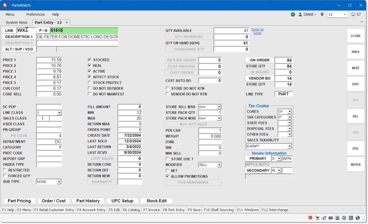
Choose between two themes, 'Light' and 'Dark'. In 'Classic' mode of the application, the theme affects the color of the border, ribbons, menu, and certain grids. In 'Standard' mode, the theme also affects the color of the interior screens.
UI
The UI (User Interface) selection determines the colors and button shapes on the individual screens. When the 'UI' selection is changed, you must log out and log back in for the changes to take effect.
-
'Classic' – Maintains the existing background color and function button shapes.
-
'Standard' – Utilizes the updated buttons and colors based on the selected 'Theme' ('Light' or 'Dark').
Below are several examples of the UI:
'Classic' 'UI' with 'Light' 'Theme':
'Classic' 'UI' with 'Dark' 'Theme':
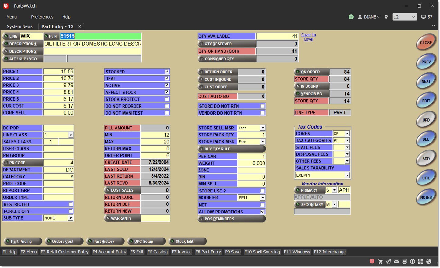
'Standard' 'UI' with 'Light' 'Theme':
'Standard' 'UI' with 'Dark' 'Theme':
Menu
-
'Classic' – When selected and the menu is opened, the menu appears over top of the screen in the upper-left corner. This is similar to the PW menu found in previous releases. This is also the default selection.
-
When the 'Classic' menu is selected, the text 'Menu' appears to the left of 'Preferences' on the Ribbon Bar. 'Menu' can be clicked to open the menu.
-
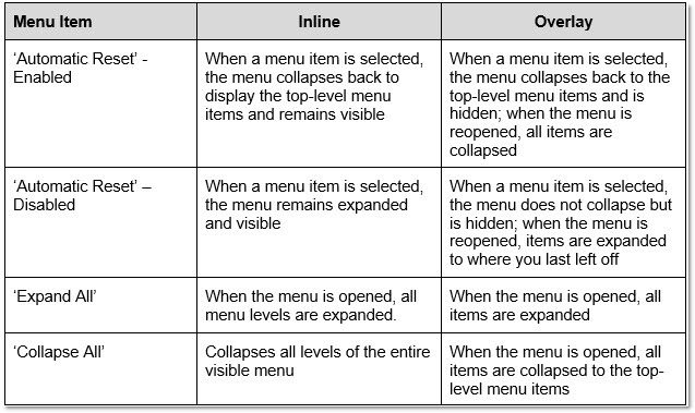
Additionally, the options 'Automatic Reset', 'Expand All', and 'Collapse All' are hidden in the ribbon if 'Classic' is the menu selection.
-
-
'Inline' – When selected and the menu is opened, the screen shifts to the right to display the menu. When the menu closes, the screen shifts back.
-
'Overlay' – When selected and the menu is opened, the menu will open over top of the screen on the left. Once a menu item is selected or the menu is closed, the underlying screen is fully visible again.
-
The following options appear only for the 'Inline' or 'Overlay' menu types:
-
'Automatic Reset' – This is selected by default.
-
'Expand All' – When clicked and the menu is opened, all items in the menu will be expanded (displayed).
-
'Collapse All' – When clicked and the menu is opened, all menu items will be collapsed to the top-level menu items.
-
-
See the Menu section above to see examples of the different Menus.
The following chart describes how the above 'Menu' options work together.
The 'Font Size' selection affects:
-
Ribbon text
-
Menu text
-
'F' Key display text
-
Username, Location number, and Terminal number text in the upper-right border
-
Screen title tab text
-
Screen title list text (e.g. Windows 'F11' Hotkey)
-
Screen title tab right-click menu text
-
All PW grids
-
All PW screen tab strip text
-
Status Bar warning and alert message text
Options are:
-
'Small' – Displays the font in Tahoma size 8 point.
-
'Medium' – Displays the font in Tahoma size 10 point. This is the default setting.
-
'Large' – Displays the font in Tahoma size 12 point.
Note: Changes to the 'Font Size' take place immediately. (As soon as the font size is selected.)
Determines where the function key shortcuts are in the application’s User Interface. Options are:
-
'Top' – The application displays the function key shortcuts at the top of the screen, below the Ribbon Bar.
-
'Bottom' (default) – The application displays the function key shortcuts at the bottom of the screen, above the Status Bar.
-
'None' – The application does not display the function key shortcuts. The shortcuts, however, still function and may be used without their display.
Store colors are used to identify different locations on screens and are set up on the Store General Setup screen, 'Store Information' tab. This determines how the store colors look, and where the store colors are in the application's User Interface.
-
'Left' (default) – The application displays the store colors on the left side of the screen.
-
'Right' – The application displays the store colors on the right side of the screen.
-
'Block' – The application displays the store colors as two solid colors.
-
'Gradient' (default) – The application displays the store colors and blends one into the other in a gradient.
Determines where the screen function buttons will appear on every screen.
Options are:
- 'Right' (default) – Displays the function buttons on the right side of every screen.
- 'Left' – Displays the function buttons on the left side of every screen.
Help

The 'Help' ribbon provides many useful links for when you are in need of assistance throughout the application.
The 'Help' ribbon provides many useful links for when you are in need of assistance throughout the application.
Ask AI a PW Question
See the AI topic for more information.
Online Help
See the Application Help topic for more information.
Keyboard Shortcuts
See the Keyboard Shortcuts topic for more information.
Contact PartsWatch Support
Opens a window to write an email to the support email that has been set up with PartsWatch support.
Support Portal
See the Support Portal topic for more information.
Remote Desktop Support (RDS)
See the RDS topic for more information.
Enable Runtime Error Window
See the Enable Runtime Error Window Help for more information.
Clear Cached Data
See the Clear Cached Data Help for more information.
Clear Web Browser Data
Clears the cache of the embedded browser, such as when using the Nexpart Counter Catalog.
About PartsWatch
See the About PartsWatch help for more information.
Items in the Upper-Right Ribbon Bar
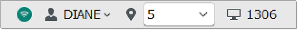
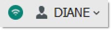
Displays a green icon with a hover-over tool tip of "Online" when the application is connected to the datacenter.
Displays a red icon with a hover-over tool tip of "Offline" when the application has lost connection to the datacenter.
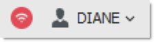
To the right of the connectivity icon is the avatar icon followed by the name of the logged-in user.
Click the down arrow to the right of the user's name to find the following options:
Manager
When clicked launches the 'Manager Approval Code' pop-up. This option will only appear if the logged-in user is designated as a manager on the Employee Setup screen.
Logout
When clicked the "Are you sure you want to logout?" pop-up is displayed.
To the right of the avatar icon is the location pin icon, and an adjacent drop-down containing a list of locations for the system in alphanumeric order.
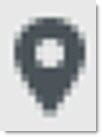
Click the location pin icon to open the ‘Browse Locations’ pop-up.
To select a new location:
-
Click in the location drop-down box, type the location number, and press the 'Enter' key.
-
Or, click the down arrow in the drop-down and select the location from the list.
-
Or, click the location pin icon to display the 'Browse Locations' pop-up, choose the desired location from the list, and click 'Ok'.
To the right of the location pin icon is the terminal icon.
This displays the terminal number.
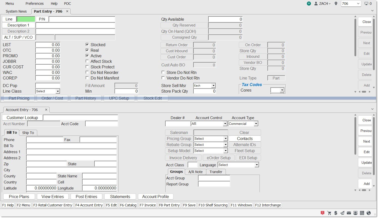
Tab Bar - Screen Title Tabs
When a screen is opened, it is opened in a tab on the tab bar of the application, similar to a web browser.
The name of the screen appears on the screen title tab for all screens.

Certain screens have different rules for what text displays on the tab when the screen is opened.
Screen title tabs can be rearranged by dragging-and-dropping the tab along the line of tabs to the desired location.
Click the downward arrow icon next to the screen tabs in order to open a list of open screens.
Click on the desired screen, or use the down arrow key to highlight the desired screen and press the 'Enter' key to bring that screen into focus. The current active screen is preceded by a checkmark.
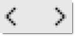
If there are too many screen title tabs to fit horizontally, the following arrows appear to navigate through the list of tabs:
To close a screen from the screen title tab, hover over the screen title tab and click the small 'x' that appears. You can also right-click the screen title tab and click 'Close'.
Furthermore, right-clicking the System News tab allows selection of 'Close All But This', which will close all screens except System News. Note: The System News screen cannot be closed.
Screen Title Tab Groups
Right-click on a tab to create a new horizontal or vertical tab group.
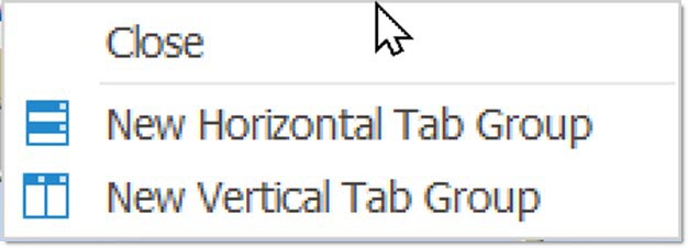
Right-click on the original tab group to open the following menu (it will say either Horizontal or Vertical, depending on your choice for the first tab group selection):
Click 'New Horizontal Tab Group' or 'New Vertical Tab Group' to create an additional group.
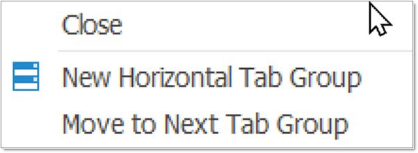
Click 'Move to Next Tab Group' to move the selected tab to the next existing group of tabs.
Once there are more than two tab groups, the right-click menu allows movement of tabs to the previous group, as well as the next tab group. In the new tab group, the following menu appears with a right-click, (it will say either Horizontal or Vertical, depending on your choice for the first tab group selection):
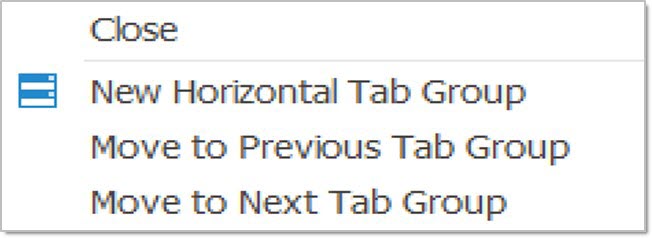
You can also click, drag, and drop tabs from one tab group to another.
Click 'Move to Previous Tab Group' to move the selected tab to the previous existing group of tabs.
See an example below of the application open with two horizontal tab groups:
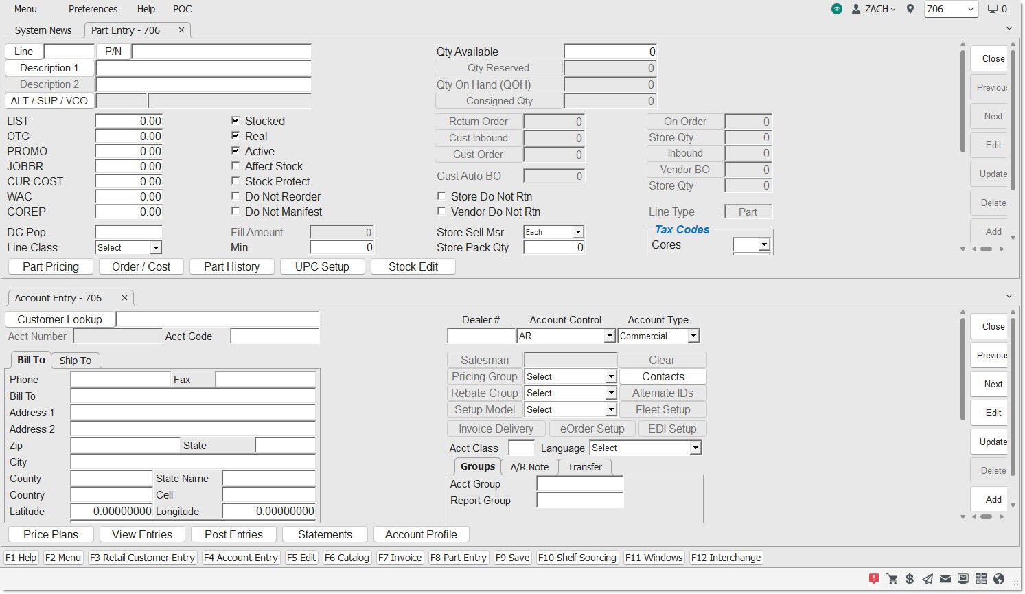
To resize the tab groups, position the cursor between the border of the group until a vertical double-arrow cursor shape appears. Click and drag up or down to resize the groups.
See an example below of the application open with two vertical tab groups:
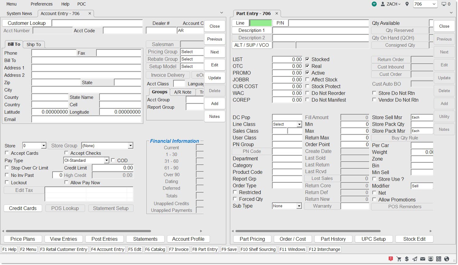
To resize the vertical tab groups, position the cursor between the border of the group until a horizontal double-arrow cursor shape appears. Click and drag left or right to resize the groups.
Bottom Border
Function Keys
'F' Accelerator Keys – The 12 'F1' - 'F12' keyboard keys are used as "hotkeys" to quickly open features and screens without following the normal navigation paths. The designated "hotkeys" display at the bottom of the border and can be clicked with the mouse or pressed on the keyboard:
The 'F2', 'F5', 'F9', 'F11', and 'F12' Function Keys are configurable and may be changed on the System General Setup screen.
Status Bar

The left-hand side of the Status Bar displays warning messages, like the one below:

The right-hand side of the Status Bar displays an icon set:
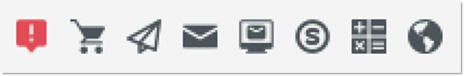
Background Processor
When clicked, a message pop-up displays showing the last time the BG processor ran. The icon will be red  if action should be taken or black
  or grey
  if the BG Processor is in an acceptable state.
eOrders
When clicked, the Sales Order Status screen is opened. This icon may be red if there are any pending eOrders.

When the Daily Sales Location icon is clicked, the application displays the output of the 'Sales by Account Group Report' using the following criteria:
-
'Location': 'All' (for multi-store) and 'Current' (for single store)
-
'Group By': 'Location'
-
'Relative' calendar date: value of 'Today'
-
'Transfer': value of 'Exclude'
Note: To see transfer sales included, or any other criteria changes, navigate to the Sales By Account Group Report screen to run the full report.
Store Message
When clicked, the 'Store Message' pop-up is displayed. See the Store Message Help for more information.
My System Messages
When clicked, the 'User's System Messages' pop-up appears. The icon will be red if there are any unread messages.
System Messages Screen
When clicked, the System Messages screen is opened.
Shop Account Invoice
When clicked, a new invoice screen is opened, populated by the configured Shop Account. If no Shop Account is configured, this icon will not be displayed.
Calculator
When clicked, the Windows calculator application is opened.
Web Browser
When clicked the default web browser is displayed with the 'URL' defined in the System General Setup screen). If no 'URL' is defined, the sales.partswatch.com website will display. Note: This option was formerly located on the menu.
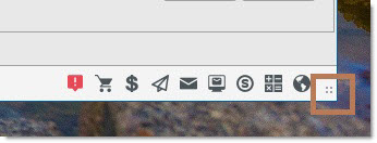
When applicable, more icons can display to the left of the Background Processor icon.

Edit
When in Edit mode on a selected screen, displays an edit icon followed by the text 'Edit'.
Note
When there is a part note, displays a note icon followed by the text 'Note'. This icon may appear on the following screens:
-
Main Part Entry
-
Part Price Entry
-
Order – Cost
-
Part History
-
Part UPC Entry
-
Part Association Setup
-
Multi-Location Part Creator/Editor
-
Main Account Entry
-
Retail Customer Entry
-
Invoice (only when trying to return a part that has a note)
Util
When the 'Util' button is clicked, and the 'Set Next/Prev' option is selected, displays a utility icon followed by the text 'Nxt/Prev;. The 'Set Tab Stops' will also cause the 'Util' to appear with either 'Util Tab' or 'Util Tab Nxt/Prev'. This icon may appear on the following screens:
-
Main Part Entry
-
Part Price Entry
-
Order – Cost
-
Part History
-
Part UPC Entry
-
Part Association Setup
Screens
The Screens - 5 minutesThe Screens - 5 minutes
PartsWatch screens provide a graphical User Interface (UI) with interactive menus, fields, buttons, scroll bars, grids and icons. The screens are designed for use by both the keyboard and the mouse and can be used with designed for use by both the keyboard and the mouse and can be used with touch screen monitors.
The application can be expanded and collapsed using the icons in the upper-right corner of the border or dragged from the corners using the mouse.
The screens can be expanded and collapsed using the icons in the upper-right hand screen border.
There are 5 types of screen in PartsWatch.
- Process screens are used to drive the business and include Point-of-Sale, Purchasing, Accounts Receivables, and End-of-Period closeouts.
- Maintenance screens are used to add, edit and delete one record at a time for line code, inventory, customer, and supplier maintenance, such as
Part Entry, Account Entry, and Employee Setup.
- Utility screens are used to add, edit and delete multiple recors at a time in order to maintain the attributes across the records added from the maintenance screens. Examples include Inventory Popularity and Ranking and Account Mass Update.
- Control screens are used to set the behavior of the processes so that the Control screens are used to set the behavior of the processes so that the functionality works as needed. Examples include Store Invoice Options and System General Setup.
- Reports output the information needed for inventory, customers, sales, and end-of-period reporting.
Screens where the Menu Item text differs from the Screen Title text:
Fields
The Fields - 4 minutesThe Fields - 4 minutes
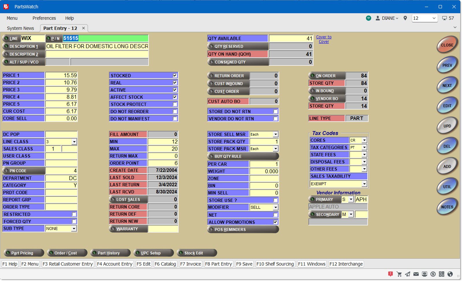
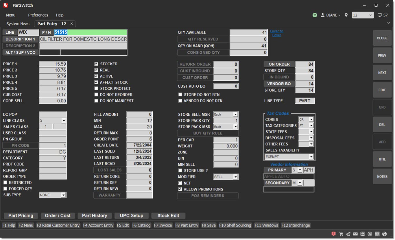
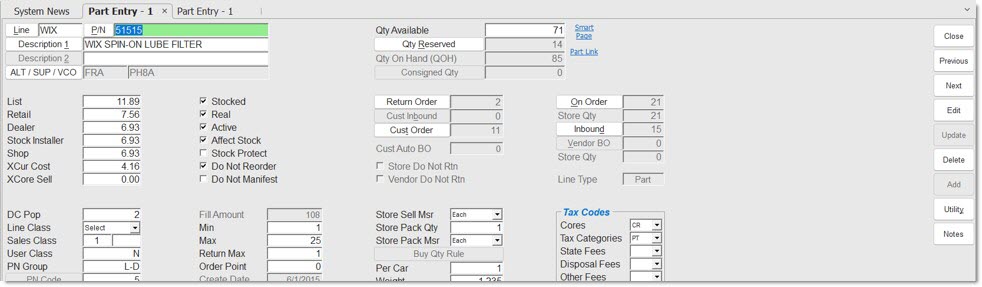
Maintenance, utility, control, and report screens are organized so that fields with similar use are grouped together.
All fields that are blue and yellow are editable and all fields that are red and All fields that are blue and yellow are editable and all fields that are red and gray are populated by the system for information only and cannot be edited.
The field with the cursor is normally green.

Depending on User Security Setups, any screens opened from the menu can viewed only or enabled for use. Any enabled screens with 'Edit' and 'Upd' (update) buttons must be in 'Edit' mode before fields are available regardless of color. Maintenance screen may display 'Edit' or 'View' in the lower right screen border.

There are six different types of fields in PartsWatch:
Text Fields are used when letters, numbers and/or special characters are manually entered and depending on the field, it may be limited to numbers only or letters only, or to a limited number of characters.
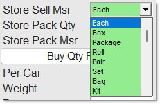
Drop-down lists are used to select a value. Click the small arrow to the right of the field or with the cursor in the field, press any of the arrow keys to display the list of possible choices and to move up and down the list. Select the desired one by clicking it with the mouse or by highlighting the selection and pressing the 'Enter' key.
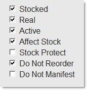
A Yes / No Checkbox also called a "flag" is a decision field. If the field is checked, it always means “YES” and unchecked always means "NO". Click the field or press the space bar to check or uncheck the box.
Spinner Fields are typically used to adjust a field value, usually found in small spaces. Click the small up or down arrow, which could be on the right or the left of the field, or with the cursor in the field, use the up or down arrow keys to get the desired value.
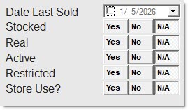
Radio Buttons are used when only one choice can be made so that checking one unchecks any others. Radio buttons can be square, round or buttons. All of the following examples are radio buttons.
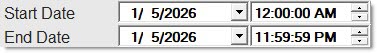
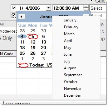
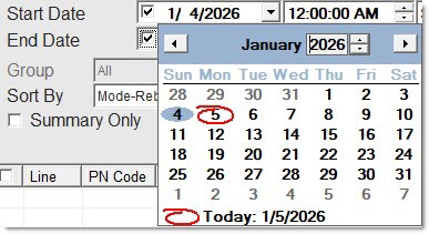
Date fields are commonly found on report configuration screens. Manually type a date or click the drop-down to select the date from the calendar using standard calendar navigation controls.
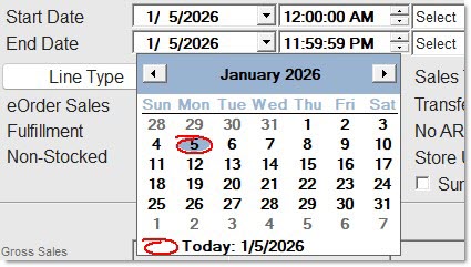
Click the month and a drop-down menu allows selection of a month.
Click the year and small up / down buttons allow selection of a year.
Click the day and the calendar closes using that month, day and year.- Click the up/down arrows in the time spinner fields to change the time reported.
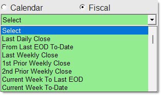
For most reports, both Calendar and Fiscal date radio buttons are available to select relative dates from the drop-down fields instead of using the 'Start Date' and 'End Date' fields.
Save changes to the screens by clicking either the 'Upd' (update) buttons or pressing the 'F9' key, or clicking the 'Save' button. If changes are made and the screen closed without clicking the 'Upd' or 'Save' button, the system prompts to save changes. 'Yes' saves the changes, 'No' does not save the changes.
Buttons
The Buttons - 6 minutesThe Buttons - 6 minutes
There are three types of buttons in PartsWatch, process buttons, which initiate a procedure, go-to buttons that open a screen, window, or pop-up, and toggle buttons which change functionality or fields displayed.
Process Buttons
Process or function buttons are used to initiate a function or process, such as 'Preview', 'Print', 'Edit' or 'Close'.
Screen function buttons normally exist in the same order down the right side of the screen with the 'Close' button at the top.
Any buttons that are not needed on a screen will not be displayed, however, if a button is needed only at certain times, it will display and be grayed out until needed.
Red buttons do not light up. The 'Close' button is the exception. It is red on all screens so that it is not accidently clicked before work is finished.
Process buttons are normally found on the right side of a screen.
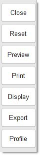
When the application is resized, the process buttons do not move.
The exception is Invoicing where the process buttons are positioned in the bottom left.
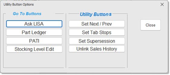
Clicking the 'Util' process button on any screen where it is available opens the following pop-up:
Go-To Buttons
"Go-To" buttons, are normally used to open a window or go-to another screen.
Because of their shape, "Go-To" buttons are sometimes called "cigar" buttons and are normally used to open a window or a screen.
The buttons are normally brown, except on the Invoicing screen where most The buttons are normally brown, except on the Invoicing screen where most are blue.
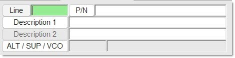
Go-To buttons have a small green light on the left side if enabled and a red light if unavailable. Hover over enabled buttons with the mouse and the light brightens. If disabled, the light remains gray. In the following example of go-to buttons:
-
Line is enabled, and the cursor is in the field.
-
Description 2 is disabled.
-
Description 1 is enabled but not selected.
Go-to buttons are used to:
-
Open a screen, a window or a pop-up where another function can be performed and typically, are round on both ends. In the following graphic:
-
'Credit Cards', 'POS Lookup' and 'Statement Setup' are all used to open a window for setup.
-
'Price Plans', 'View Entries' and 'Post Entries' are all used to open another screen.
-
'Statement Setup' is used to open a window to output a customer statement.
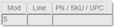
- Buttons that are round on the left end and flat on the right end and are generally used to open a browser window to search for data. However, there are exceptions where the button is flat on both ends such as the MOD, LINE and 'P/N/SKU/UPC' field on the Invoice Point of Sale screen.
- These buttons may be followed by a text box so that data can be entered or viewed. In some instances, both the field and the button are available. For example, an account can be typed in the 'Customer Lookup' field or found from the 'Find Customer' window opened from the 'Customer Lookup' button.
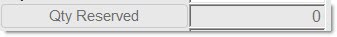
In others, either the field or the button is available, but not both. For example, the QTY RESERVED button is available to display the tickets the part is reserved on; however, since the quantity reserved can’t be edited, the field is grayed out.
-
Go-to buttons may also display information, typically in a pop-up that is read-only and whose purpose is to simply convey information. Examples are read-only and whose purpose is to simply convey information. Examples are the 'Part Detail' and the 'Total' button on the Invoice Point of Sale screen. When clicked, a pop-up opens with additional information.
Toggle Buttons
Toggle buttons are go-to buttons that switch between two states in order to change a function or display more or less fields.
Examples of toggle buttons:
When clicked, the 'Default Printer' button on the Invoice Point of Salescreen toggles to 'Select Printer'. One state will send the invoice to the default printer and the other will prompt to select the printer at print time.
The 'Display Search Criteria' button that displays the search filter fields on the 'Kit List' tab on the KIT SETUP screen toggles to "Hide Search Criteria" to hide the search filter fields.
The 'More>>' and '<<Less' buttons display / hide additional fields for setup. The pop-up remains in the last state of 'More>>' or '<<Less' fields for the session and resets the next time the feature is opened.
Keyboard Use
Info Sheet: Keyboard Shortcuts Document - 3 pages
Using the mouse is the quickest way around the screens. Position the cursor over a field and left-click to select that field. However, PartsWatch, where possible uses familiar Windows® keyboard commands on the screens.
Grids
The Grids - 3 minutesThe Grids - 3 minutes
A list of data is displayed in a grid or table and is used anywhere multiple rows of data are displayed.
See the PartsWatch Grid Help for more information.
Right-Click Menu
Right-Click Menu - 4 minutesRight-Click Menu - 4 minutes
Wherever possible, even though it is not intuitive, the Windows® right-click menu feature provides additional functionality for the part or customer in focus.
For example, right-click a row in the Invoicing grid and click:
- 'View in LISA' to open the LISA Transactions Report in the 'Display' screen for the customer and part in focus. Right-click a row in the report screen to display a menu with additional information. Click the 'Back' button to return to the Invoice Point of Sale screen.
- 'Qty Reserve' to display a list of every open sales order with a quantity of the part on reserve instead of clicking the 'Qty Reserve' button.
- 'General Part Info' to open the Part Entry screen.
- 'Qty Available In All Stores' to open a window with the quantity available in each store for multi-stores.
Any menu items that are not applicable to the part in the row clicked will either not display or be grayed out. For example, the 'Show Fees' menu only displays if a fee is attached to the part.
Not all grids have a right-click menu. Try right-clicking a row whenever a grid is in each grid to see which ones do.ing text here
Windows / Pop-ups
Although "windows" and "pop-ups" are basically the same thing, windows are generally larger and require data input or action while pop-ups are smaller and opened by the system to notify, prompt or question. But normally, anything that opens in foreground of a screen and asks, informs or waits for data input is referred to as a window or a pop-up.
Screen Tabs
Tabs are used to display other information on a screen, or other screens that are either related to the same process or have like values.
Tool Tips
When the mouse is positioned over ("hover-over") certain screen elements, the application displays a tool tip of the element's text.
This is helpful if the text on the screen is truncated or word wrapped.
The items that will display a tool tip include:
-
Labels on text or numeric fields
-
Labels on checkbox fields
-
Labels on date fields
-
Labels on drop-down lists
-
Labels on dates
-
Labels on screen function buttons
-
Labels on lookup buttons
-
Labels on navigation buttons
If the screen element is read-only or disabled, the tool tip does NOT appear.